Beds
Spark design & innovation for Auping beds | Trend research and CMF design
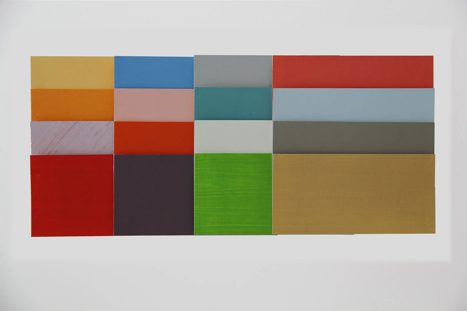
Material combinations of powder coated steel and fabric, wood or leather


Male shaving and grooming products
Philips Norelco | Trend research, CMF design and implementation
Shaving and grooming products for the global market


Oral health care products
Philips Sonicare | Trend research, CMF design and implementation
Series of electric toothbrushes, accesoirees and brushheads for the global market


Female beauty products
Philips | Trend research, CMF design and implementation
Series of beauty products for Asian, European and US markets


Garment care
Philips | Trend research, CMF design and implementation
2 series of steam irons for the European market



New spaces for project based teaching
Comenius college | capelle aan de ijssel
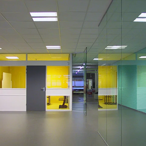
The Dutch educational environment is constantly changing. A lot of schools have replaced class room based teaching with independent project based teaching. With the need for different spaces I helped them design attractive open study areas.


New Colors for Comenius College
Rotterdam


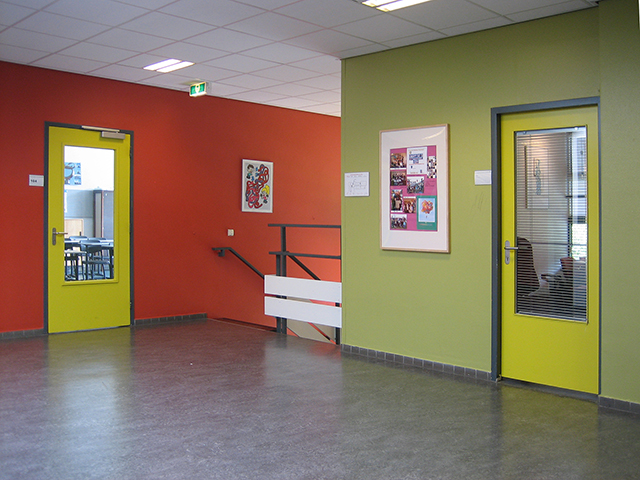
Old class rooms converted in practical lab for project based learning
Comenius college | Capelle a/d IJssel


New entrance hall with meeting areas
University of Tilburg
Interior concept and design to facilitate more communication between students.


Color protocol for a college
St. Antoniuscollege | gouda
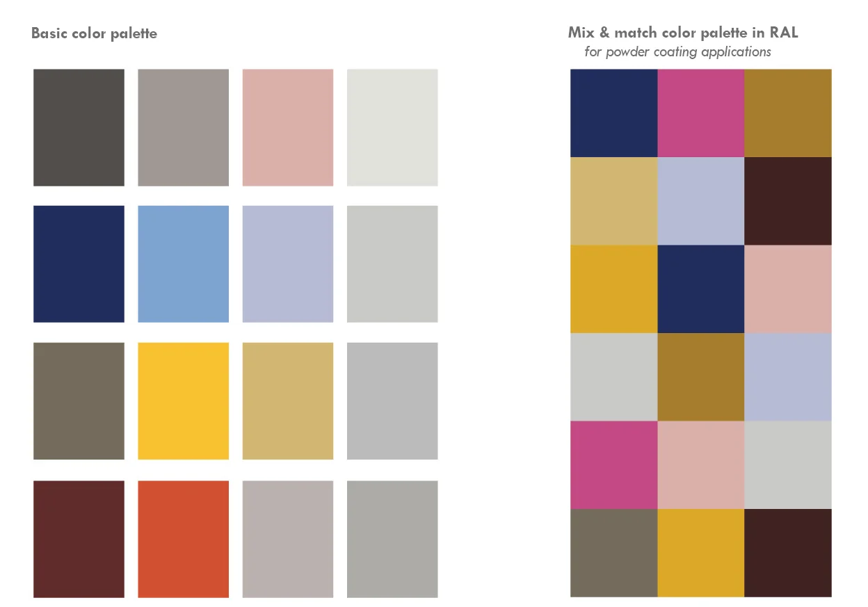
I created a color protocol and different palettes to give the school the freedom to make changes over the years whenever their budget was sufficient. Each floor has it's own main color based on the dutch primary modernistic colors blue, yellow, red and grey. For furniture and loose objects I created a color palette based on the industrial RAL. These colors fit on each floor.


Bathroom finished with polyurethane
RESIDENTIAL | ROTTERDAM
This bathroom color is similar to the color of a tub full of water. Floor, walls and furniture are all coated in polyurethane.

A historical home for retired priests gets a new coat of paint
RESIDENTIAL | ROTTERDAM
They live in a wonderful house from the 1800's in the middle of the town Leiden in the Netherlands. Previous painters painted everything off white which was in sharp contrast with the big oak stairs and the heavy wooden paneling. An historian was brought in to find out what the original colors were. By taking of layers of paint with a scalpel we were able to find out the original paints. I created a color palette derived from these findings and translated it to a more dynamic and saturated color palette.


Parking garage with colors that spark
PRIVATE GARAGE | ROTTERDAM
Parking garages are the kind of places you have to be but want to escape as quick as possible. This parking garage is painted with an unexpected pink, bright yellow and fierce red to complement the hard concrete.


Large building appears less colossal with light and airy colors
qua wonen | capelle aan de ijssel
The left side is already painted on the inner facade. The right side has the original colors
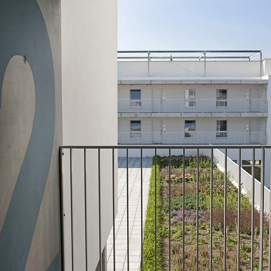
Two large structures in typical 1970's style architecture where colored in dark browns and blues. The horizontal lines were emphasised and different colors where used to mark the different sections and entries. I created a color palette of light blue's and green's to give the building a lighter appearance. By using colors close to the Dutch skies the windows blend in with the facade which makes it a calm and even surface.


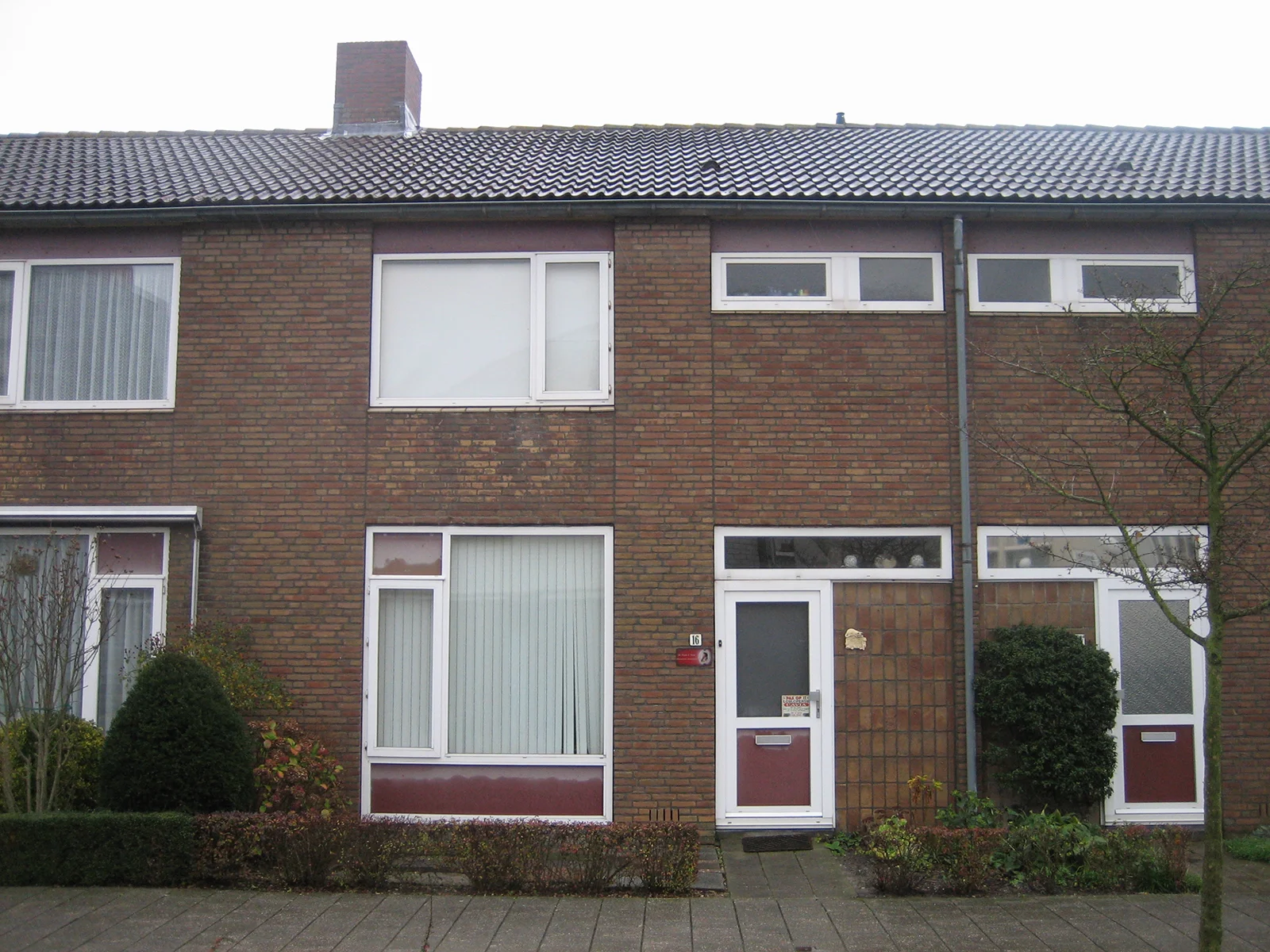
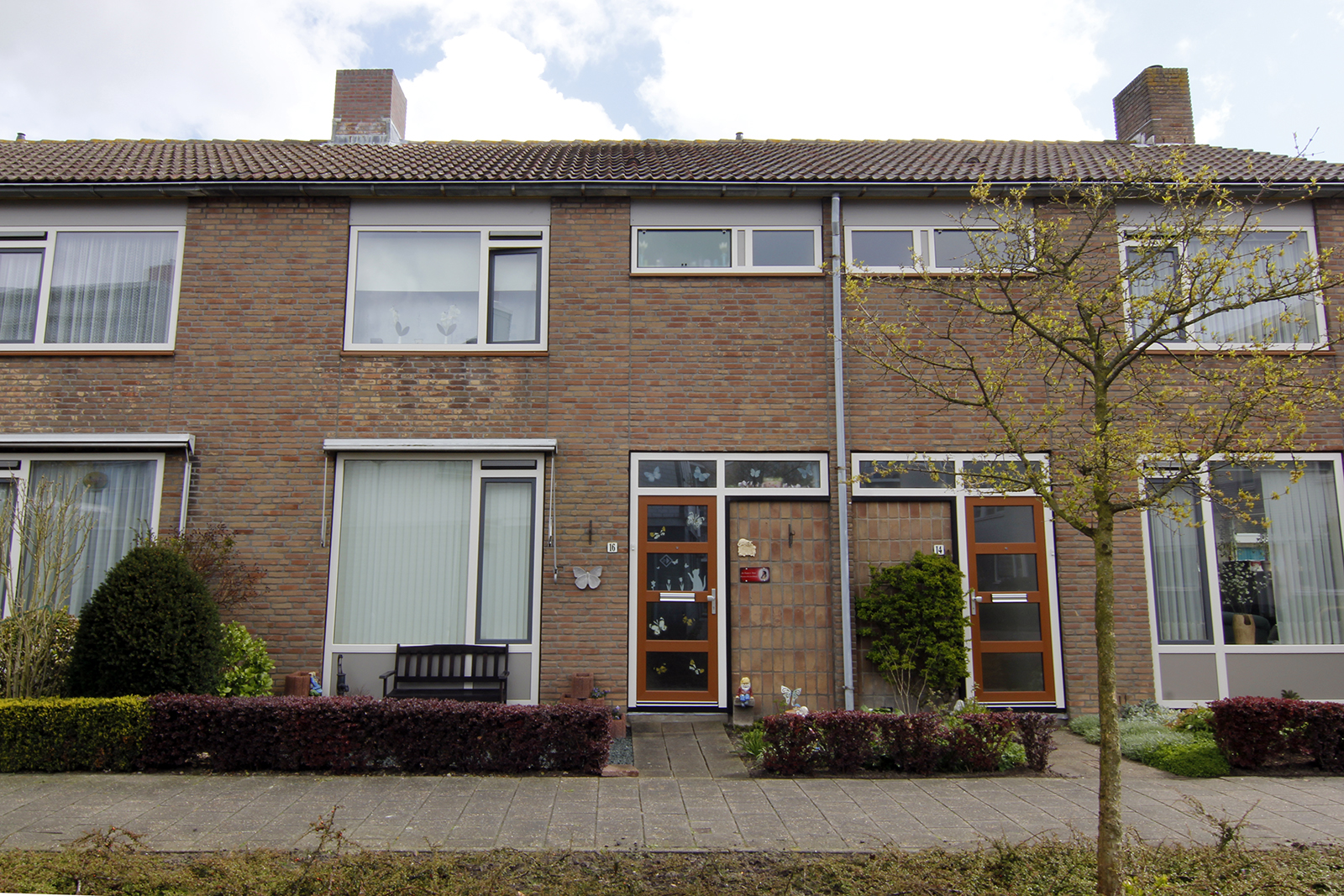
Working with the limited palette of plastic frames
L'escaut | Vlissingen
Previous situation
In this social housing project plastic frames are replaced with new ones. These palettes are usually limited to a dozen colors. Window sills are replaced with powder coated aluminium and the facade is cleaned which gives it an overall fresher look.

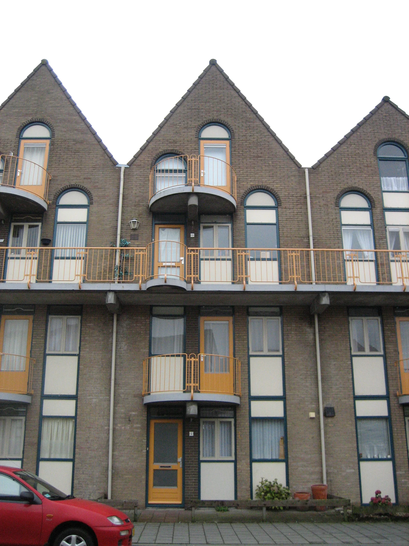
New colors for social housing in coastal area
L'escaut | vlissingen
Previous situation
Colors and finishes in coastal areas tend to fade and deteriorate faster due to salt and sun. That's why lighter colors due better in these areas. The red is used to add contrast, the floors of the balconies are red too which gives a warm glow when stepping outside.


Color research
Colors come and go with light. Light conditions vary on different latitudes, colors used close to the equator have a different appearance than when this same color is used in nordic areas. I'm always curious why places use their own colors and what stories lay behind them.
