Large building appears less colossal with light and airy colors
qua wonen | capelle aan de ijssel
The left side is already painted on the inner facade. The right side has the original colors
Two large structures in typical 1970's style architecture where colored in dark browns and blues. The horizontal lines were emphasised and different colors where used to mark the different sections and entries. I created a color palette of light blue's and green's to give the building a lighter appearance. By using colors close to the Dutch skies the windows blend in with the facade which makes it a calm and even surface.


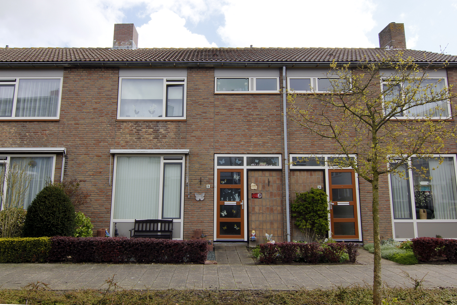
Working with the limited palette of plastic frames
L'escaut | Vlissingen
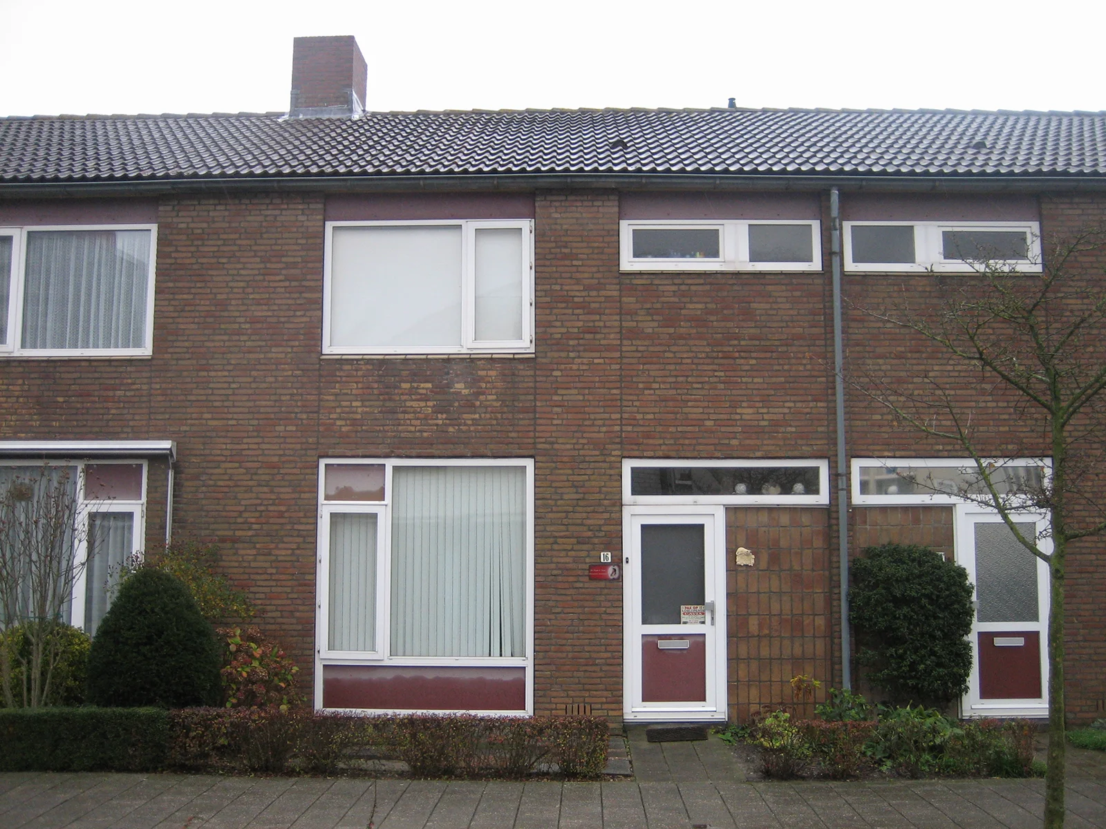
Previous situation
In this social housing project plastic frames are replaced with new ones. These palettes are usually limited to a dozen colors. Window sills are replaced with powder coated aluminium and the facade is cleaned which gives it an overall fresher look.


New colors for social housing in coastal area
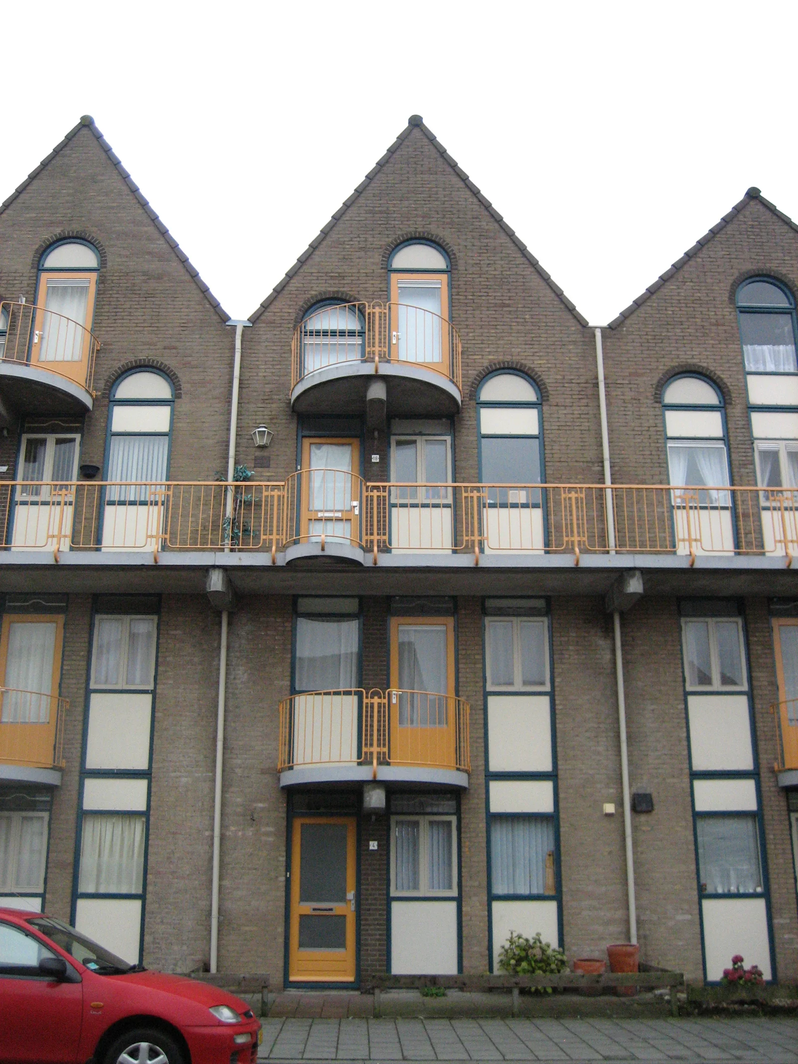
L'escaut | vlissingen
Previous situation
Colors and finishes in coastal areas tend to fade and deteriorate faster due to salt and sun. That's why lighter colors due better in these areas. The red is used to add contrast, the floors of the balconies are red too which gives a warm glow when stepping outside.


Color research
Colors come and go with light. Light conditions vary on different latitudes, colors used close to the equator have a different appearance than when this same color is used in nordic areas. I'm always curious why places use their own colors and what stories lay behind them.


